Try the Prototype!
Mobile | Desktop
ABC – Always Be Designing (just go with it). The way I tend to work is basically variations of the Word Vomit method. I just kind of do it and clean up what doesn’t work. Be it writing, organizing and now, UX Design. pengWIN 1.0 and Swing the Big Sword VII are both examples of that. The designs work and evolved through usability testing, but I was laser focused on the User Flows and getting them done before my class deadlines that I wasn’t able to really make the designs pop. So now I’m going back and redesigning them. The research and user flows were done so this was all about making them more visually appealing.
I decided to do a major overhaul of my pengWIN charity app and website first. All user flows are the same, but the app has a much nicer, sleek, modern looking interface to it. Version 1.0 was me learning Adobe XD and trying to replicate the look of the website I made. On screen it worked for me but when viewed on a phone or mobile device, it didn’t.
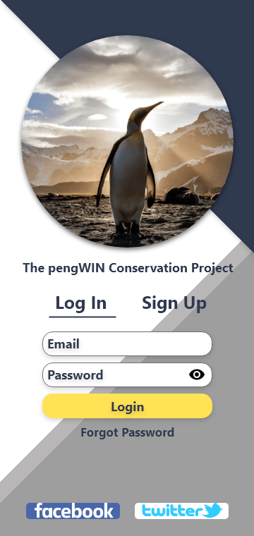
The Login Screen has a cohesive look to it. I never got the login screen right on version 1.0. The user is greeted by a welcoming login screen here that’s easy to decipher.
The user has the ability to signup from this screen as well.
Also included are links to two social media outlets that pengWIN uses to communicate with their community.
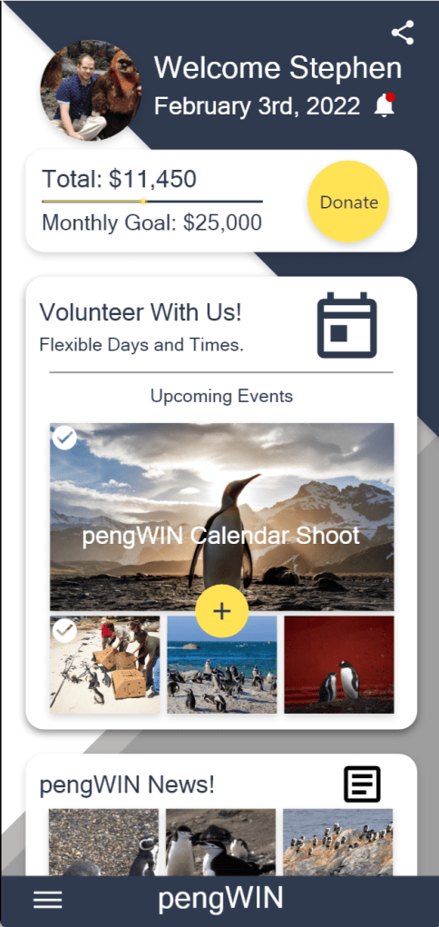
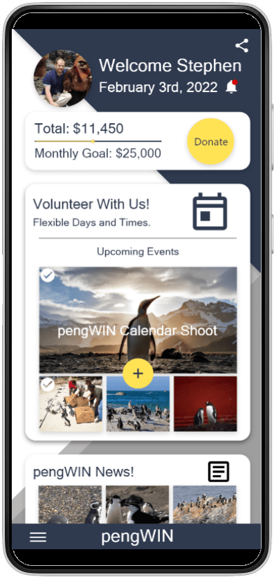
The home screen has a much simpler layout here. All information is grouped into a vertical card format. As a donation-based organization the monthly goal is up top and clearly visible helping to drive attention and donations.
Underneath that is the ability to sign up to help donate time as a volunteer. If they already signed up for an event, they will see a check mark in the corner of the image. Tapping on yellow “+” call to action will take them to the Volunteer Portal.
The upper right corner also houses a notification bell and the ability to interact with social media. Tapping on your profile picture will take the user to their user profile.
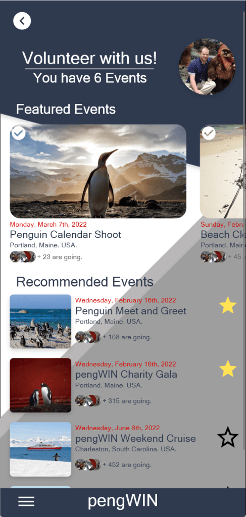
The Volunteer Portal has Featured Events up top in a horizontal slider and underneath that are recommended events.
Next to the recommended events are toggles where you can favorite them and sign up quickly.
At the top the user can see the number of events available to them.
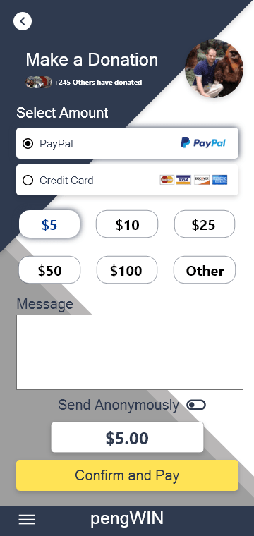
The donation page has been reworked to allow the user to add a message to the organization or donate anonymously if they wish.
Up top, the user can see how many others donated this month which can drive engagement and donations.
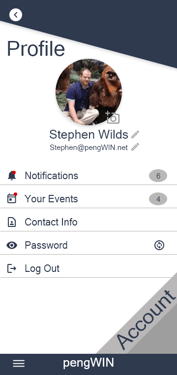
The main profile screen allows the user to change their picture, name and email address.
Under that are links to all their notifications and events with indicators showing if any are new and how many total are waiting.
The user is also able to changes all their contact information and password from this screen as well as log out.
If the users taps on the word “account”…
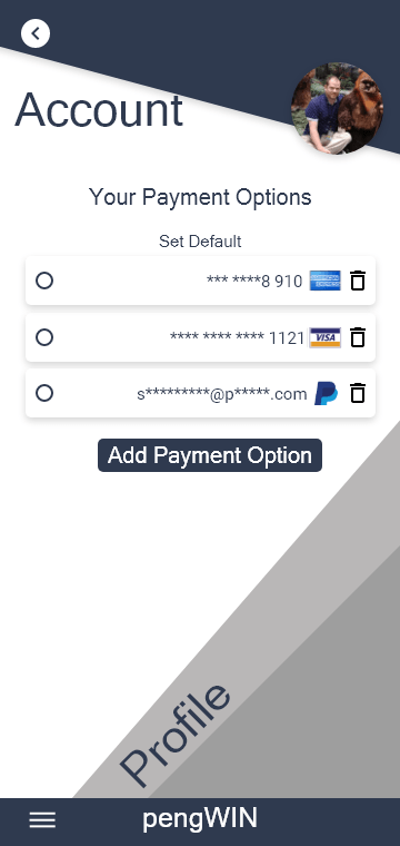
It will take them here where they can add and delete payment options for donations. They can also select a default payment method to save time at checkout.
The Website
I wanted the website to have the same look as the app. While the home screen is vastly different, the feel and color scheme unmistakable as the same organization.
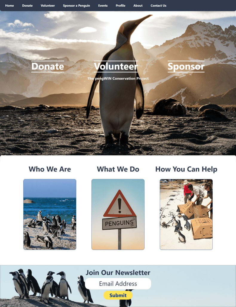
I wanted to clean up the home screen. Less is often times more and I like this cleaner look better. The user flows are the same and are now quite literally front and center. Initially there was a lot of information on the home screen, now we have a large Hero image and the links that are most helpful in the middle. This allows the user to immediately identify how to donate or volunteer and can help drive interest and traffic to those areas of the site.
Donation Page
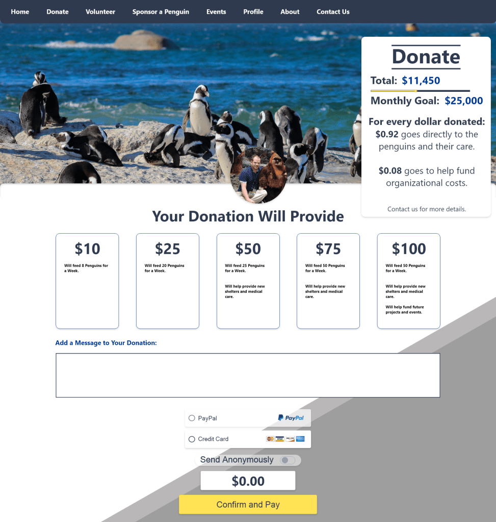
Now the user can choose from five different donation amounts, each giving a rundown of what that amount actually does for the organization. The payment selection is cleaner, and the user also has the ability to leave a message and send anonymously if desired just like in the app.
Volunteer Portal
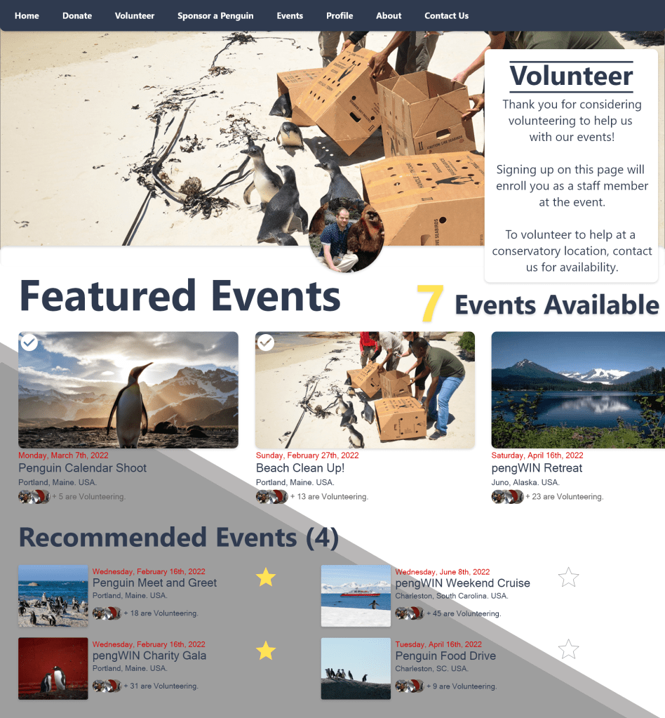
This mimics the app, just on a larger screen. Featured events up top, and recommended ones underneath. This and the Events page are twins of each other, but ones allows the user to sign up to attend, and the other allows the user to sign up to volunteer. Confirmation pop-ups clearly remind the user what they are signing up for to avoid mistakes.
Sponsor a Penguin

This is a twin of the Donation page but allows for a monthly recurring donation called a sponsorship.
I’m still working on the other pages for this design as well as the website, but wanted to provide an update on what I’ve been up to. Thank you for reading, and I will be updating this periodically as I have more to show.
