About the Project
The Challenge:
This was my very first UX Design Case Study for my class. I was given the prompt to Design an app that allows users to preview current and upcoming movie trailers.
My Role:
User Interview and Analysis
Persona Creation
Wireframing
UI Design and Prototyping
Usability Testing
Lights, Camera, Action
The Process
Validate Hypothesis with interviews and user research.
Create personas, storyboards and initial user flow
Focus on research and user stories to determine MVP
Conduct a competitive audit
Initial wireframing
User Test and Iterate
Final Mockups and next steps.
Hypothesis
People of all ages and walks of life enjoy movies and sometimes it can be hard to know if there is actually anything playing that they would want to see. They may not have the time to visit mainstream sites like YouTube and manually type in each movie title to watch a preview. However, they would be happy to use an app dedicated to giving them just that information with the ability to watch the previews within that app in a sortable, efficient manner.
Understanding the User
I knew what I liked in an app like this as I’m an avid user of video-based apps but I needed to know how potential users liked to use mobile apps and their viewing habits. I conducted five user interviews as well as placed a short survey on social media. I then broke down the answers and transcripts to find trends and patterns to come up with an idea of how I should focus my design.
User Research:
After going over all the data I had a good road map for what the users wanted:
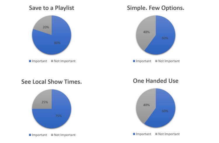
Save to a Playlist
80% of the participants wanted the ability to make a playlist
Simple. Few Options.
60% of the participants mentioned they wanted a clean interface with few distractions.
Local Show Times.
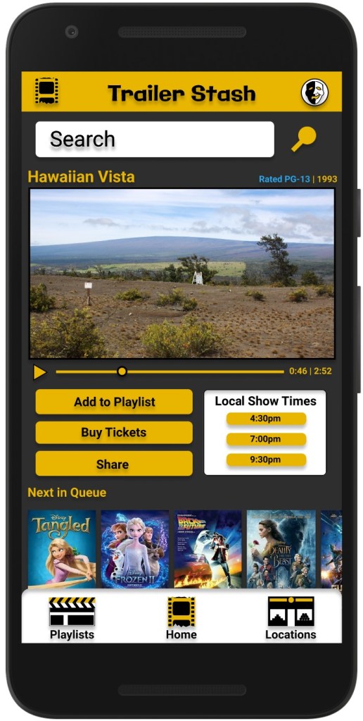
75% of participants indicated it would be helpful if previews for current movies would show local show times.
One Handed Use.
60% of participants indicated their use habits typically have them using their phone one handed.
Personas
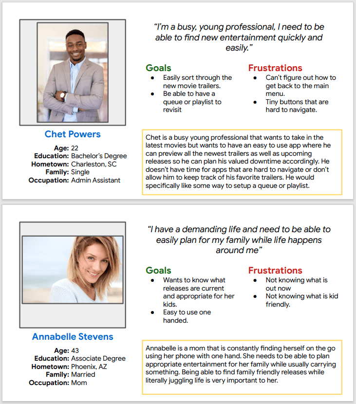
I created two personas and constantly came back to “talk” to them while working through the project.
The overwhelming majority of my user interviews indicated they lead busy lives so while both personas represent busy lifestyles they each have their own use case and that helped me understand where to spend time with designing for efficiency.
Designing for these lifestyles will also benefit users that have a slower pace or more relaxed lifestyle by offering them a streamlined experience as well.
User Journey and MVP
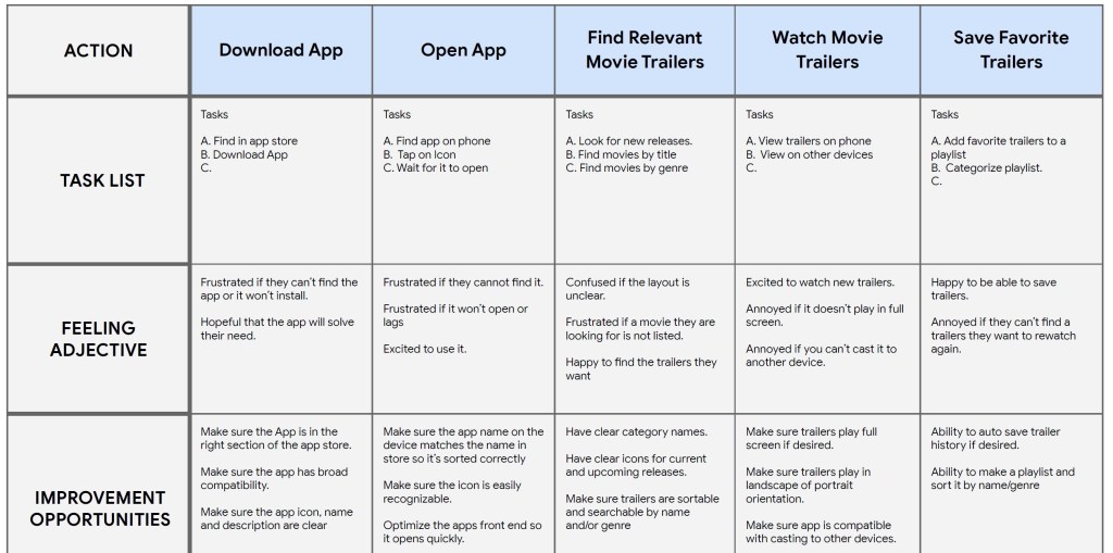
MVP Solutions:
1. Give the users the ability to save movie previews to a playlist.
2. Have a focused app that is simply targeted on viewing movie previews.
3. Let the users see local show times near them for current movies they are watching the preview for.
4. Design the UI to be used effectively with one hand.
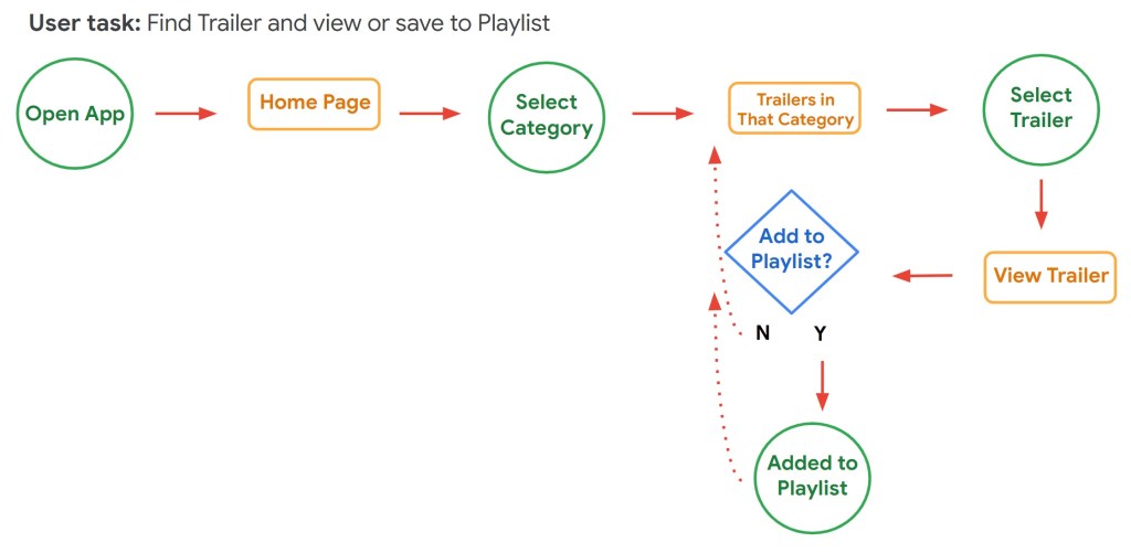
Basic User Flow
I created a user flow with the least amount of steps needed to find a movie trailer and save it to a play list based on the main goal of “I want to be able to find movie trailers and save them to a playlist”
Putting it together
Ideating and Low-Fi Wireframing
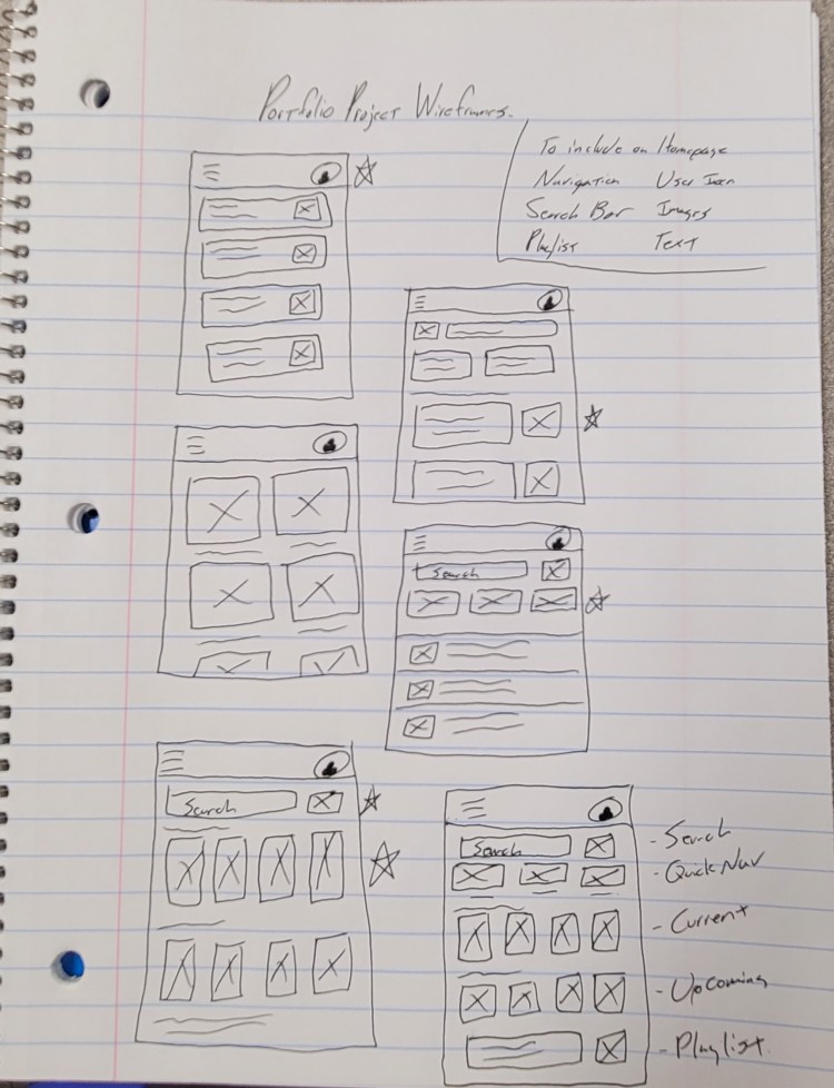
I started with drawing ideas on paper and made notes about the design ideas that seemed to gain the most support or positive reactions.
Once I had a good outline of what the base design could look like I started to mock it up as a wireframe in Figma.
Mid-Fi Wireframe
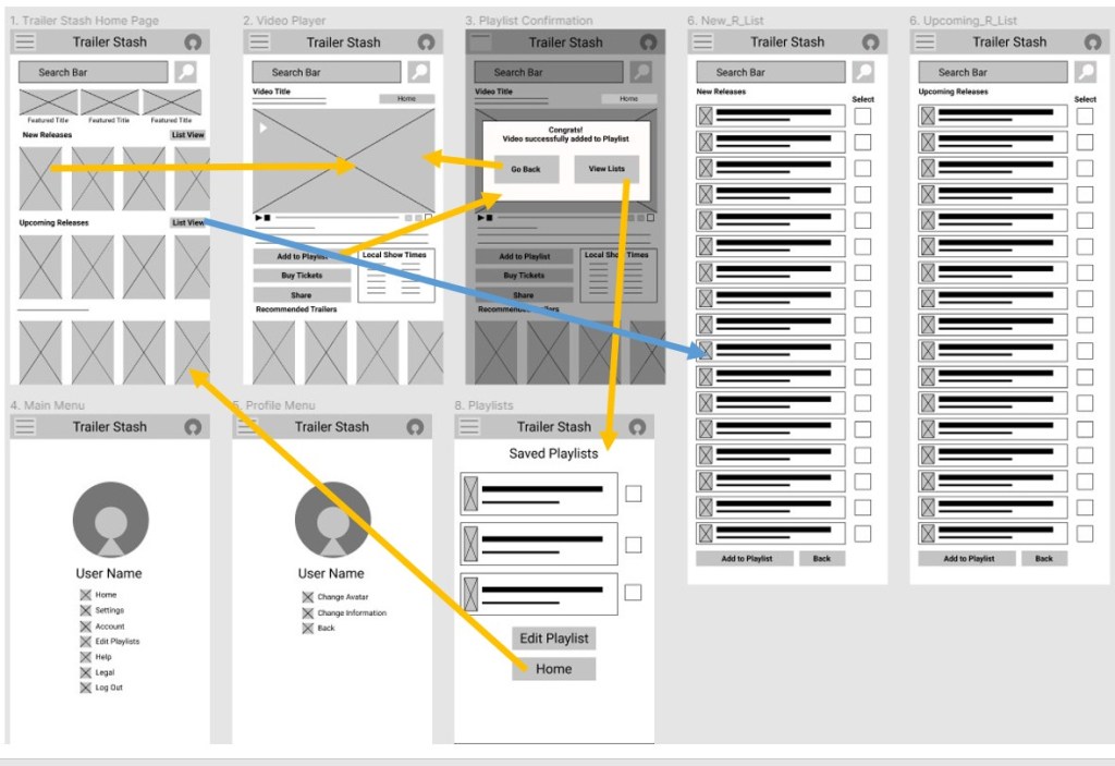
User Test Findings
1. Users were missing how to access the playlist without having to add a video.
2. Users felt that having the nav bar at the bottom would make it easier to use one handed.
3. Users found separating the previews between current and upcoming useful, would like to know about brand new releases.
4. Users did not understand why there were two “List view” buttons.
5. Users wanted the ability to make playlists quickly for viewing later.
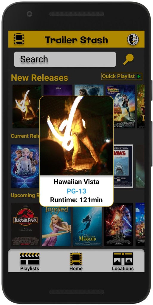
6. Users wanted to quickly see ratings.
User Solutions:
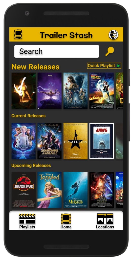
1. Add a dedicated Playlist button to the Nav bar.
2. Move Nav bar to the bottom of the screen.
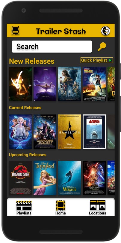
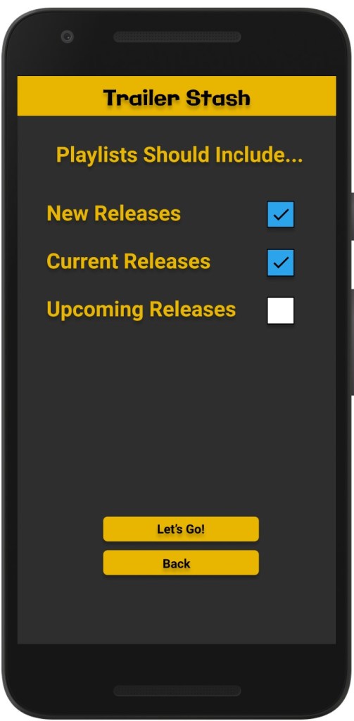
3. Keep Current and Upcoming, add a “New Release” section.
4. Consolidate “List View” to one button on home screen. Lists will have check boxes to allow for quick playlists.
5. Add a long press option to bring up an overlay to show the rating of that movie.
Visual Design
What I Learned
This was my very first UX Case study and I had a lot of takeaways, here are a few key learnings I had.
Research is key! Some things I thought users would want ended up being confusing or not needed. Designing for them based on their wants is what will let me make a successful design.
Personas are invaluable for referencing back to and designing for. They help keep the design focused on what the users want.
User testing is as important as research. Research and interviews will help inform me of the goals and design problems to find solutions for, while the testing lets me know how well I did in solving them and alleviating pain points. Without testing I could spend a lot of time designing a product that users don’t want to use.
Ask more relevant research questions. This may seem straight forward but when doing initial research for this project I focused more of my questions on app use in general and focused less on specifics regarding video-based app or user behaviors surrounding similar apps. The questions I asked were valuable, but I learned a lot more about how users used video-based apps during the testing phase. I should have asked more related questions up front to minimize work later. All the questioned I asked were relevant, but I missed a few opportunities in the beginning to really dig into users behaviors with this type of app specifically.
