
About the Project
The Challenge:
This was another project for my UX Classes. I was to Design an app that allows users to better communicate with their home builder and receive updates.
My Role:
User Interview and Analysis
Persona Creation
Wireframing
UI Design and Prototyping
Usability Testing
Getting Started
The Process
Validate Hypothesis with interviews and user research.
Create personas, storyboards and initial user flow
Focus on research and user stories to determine MVP
Conduct a competitive audit
Initial wireframing
User Test and Iterate
Final Mockups and next steps.
Hypothesis
Building a house is a major life event that can be made harder due to poor communication with the builders and lack of timely updates. Having an app as the go-to method of communication between the customer and builders could ease the process and allow the builders to offer updates quickly.
Understanding the User
Having gone through this process myself I had a ton of experience to draw from, but I needed to do some research to see if other people had a similar experience. I wanted to see what potential users had to say about the build process and what features they would find valuable in an app as well their frustrations and pain points. It was also important for me to understand how the user went about contacting the builders previously as well how they normally use mobile apps in their daily life.
As this was for a class with a tight due date, I interviewed three people that have gone through the build process as well as posted a quick answer survey on social media to help get more data in a short amount of time.
User Research:
After going over all the data I had seven key points to focus on:
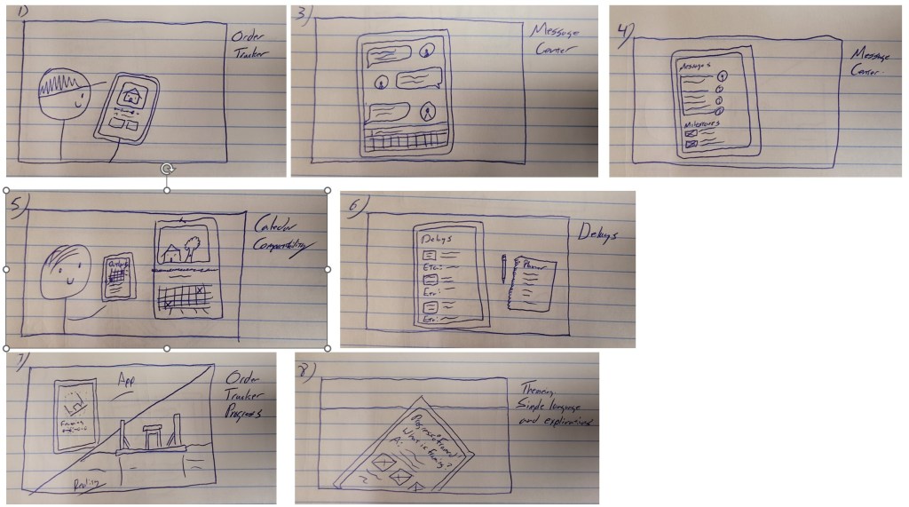
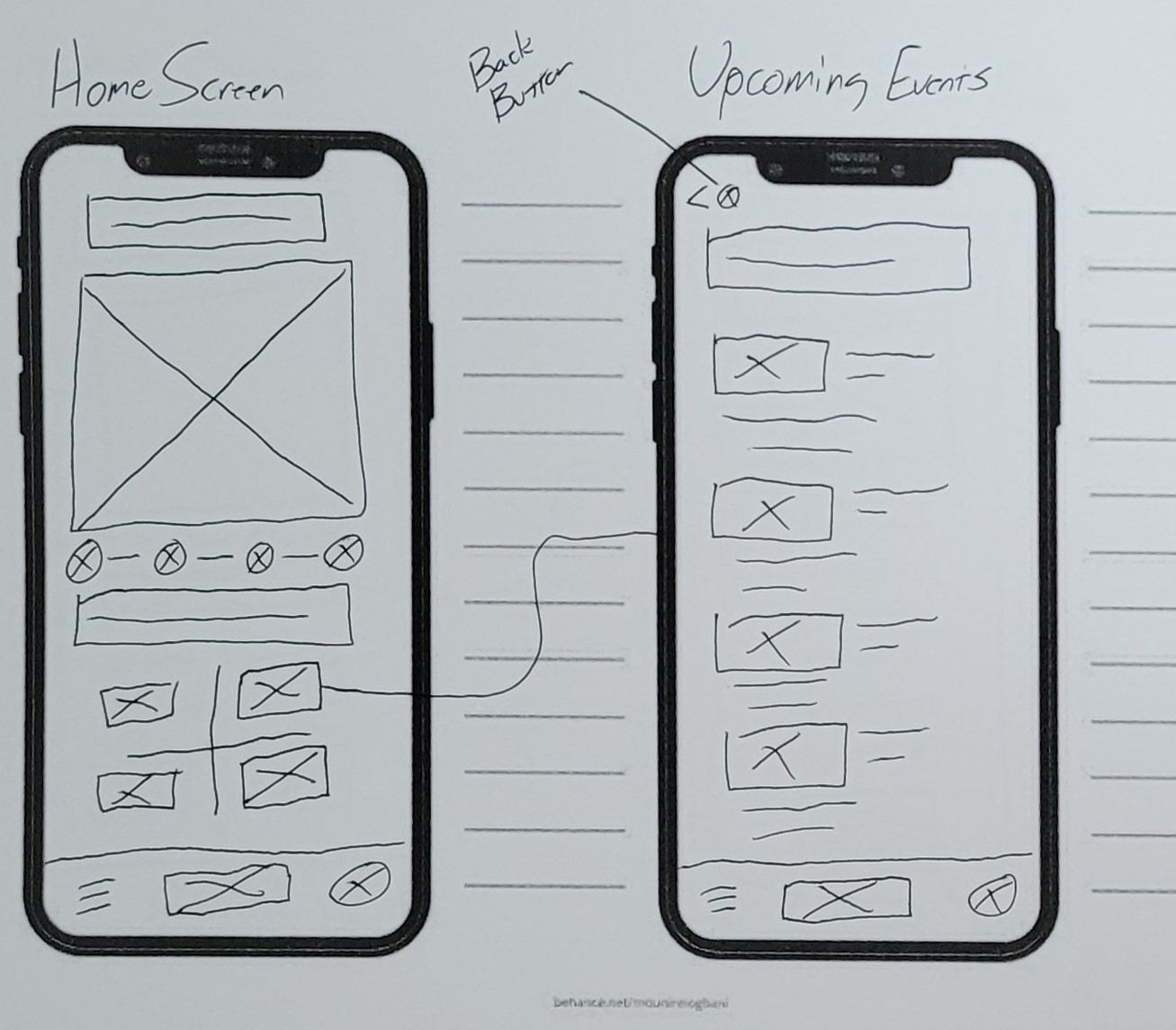
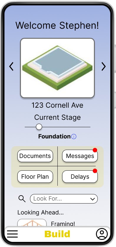
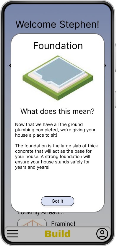
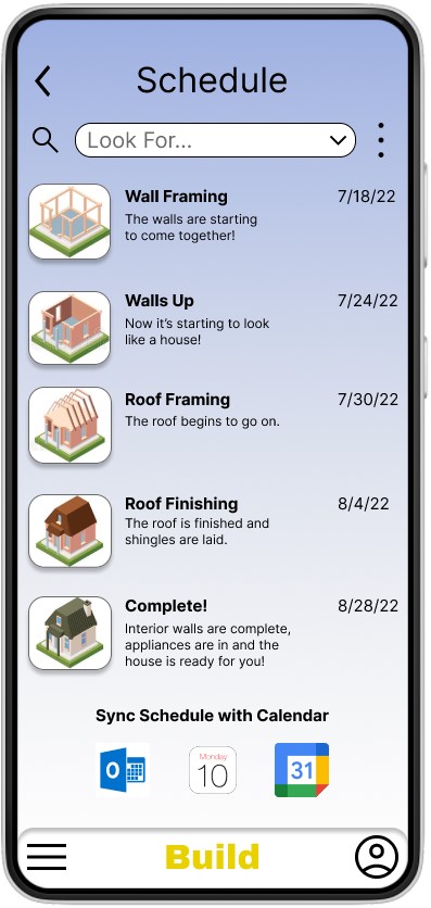
The Order Tracker
Rationale: One common frustration uncovered during the interviews was not knowing where in the process the home build was at. Many customers are out of state or town and can’t stop by to see the process, so this gives them an idea of how far along it is.
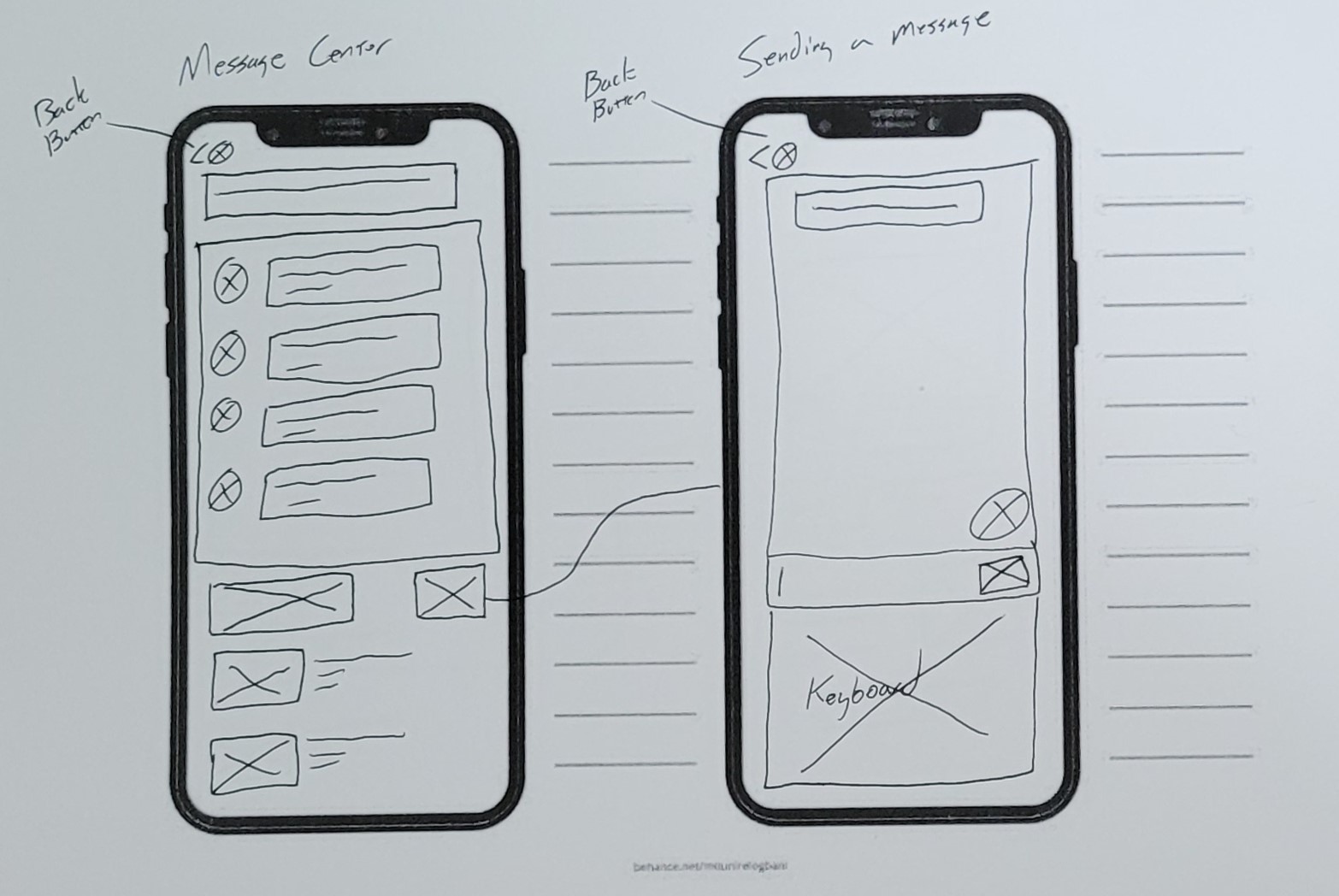
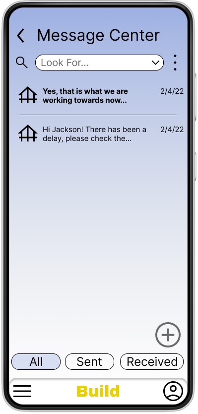
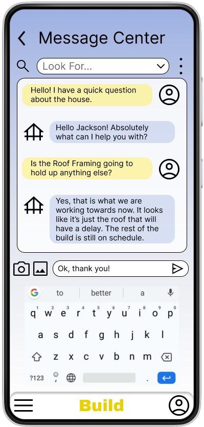
The Message Center
Rationale: The biggest frustration from the interviews was the inconsistent communication and text messages/emails getting lost and unanswered. Having one central location for each user will make it easier for the builder to see who is trying to communicate with them . This will reduce the tendency for messages to get lost or overlooked. Instead of the builder having to find emails and text messages from customers mixed in with their other ones, this gives them one specific place to look for that communication.
Calendar Compatibility
Rationale: Interview participants expressed interest in having the app be able to use their phone’s calendar to schedule out appointments, communication and milestone moments.
Friendly Theming
Rationale: The interview participants want clear communication and to be able to easily understand the process. By keeping the wording simple and using a friendly tone in the language it will make the app more inviting. Keeping the technical terminology to a minimum can also reduce confusion and make the process easier to understand for the average person.
Accessibility
Rationale: This app will be used by a wide range of users. It needs to be useable for people that have accessibility needs as well.
Notifications
Rationale: Users want consistent communication with their build. These notifications will let them know exactly when there is new information available to them.
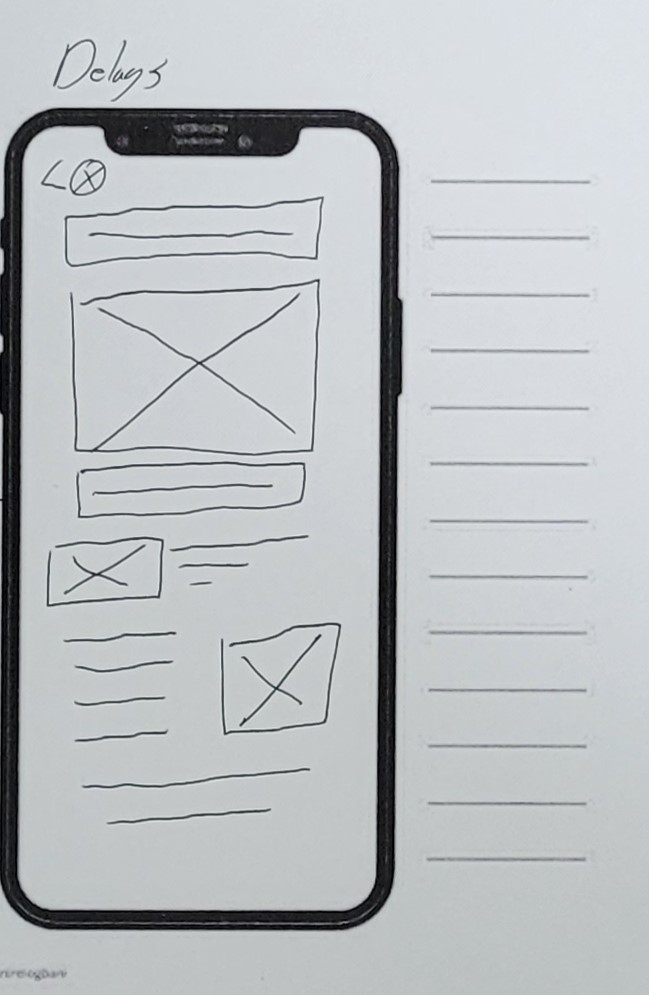
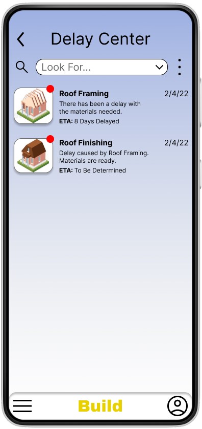
Delays
Rationale: Users overwhelmingly wanted to know why a delay is happening. Not necessarily the root cause but what it is and how it is going to impact the build. While delays are very common in building a house, having them available to view in the app and see them being worked through can make it easier to understand them.
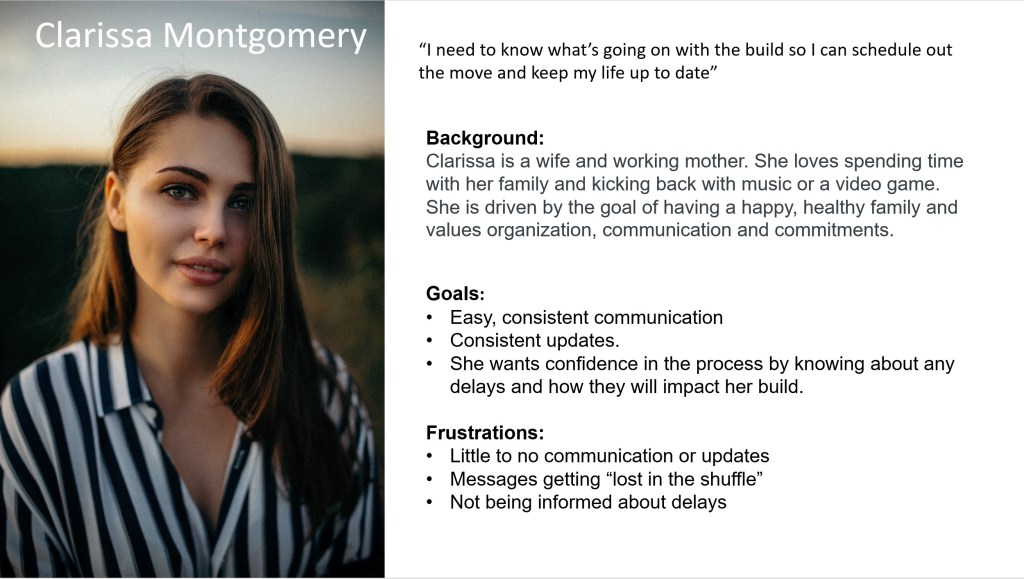
Personas
MVP Solutions:
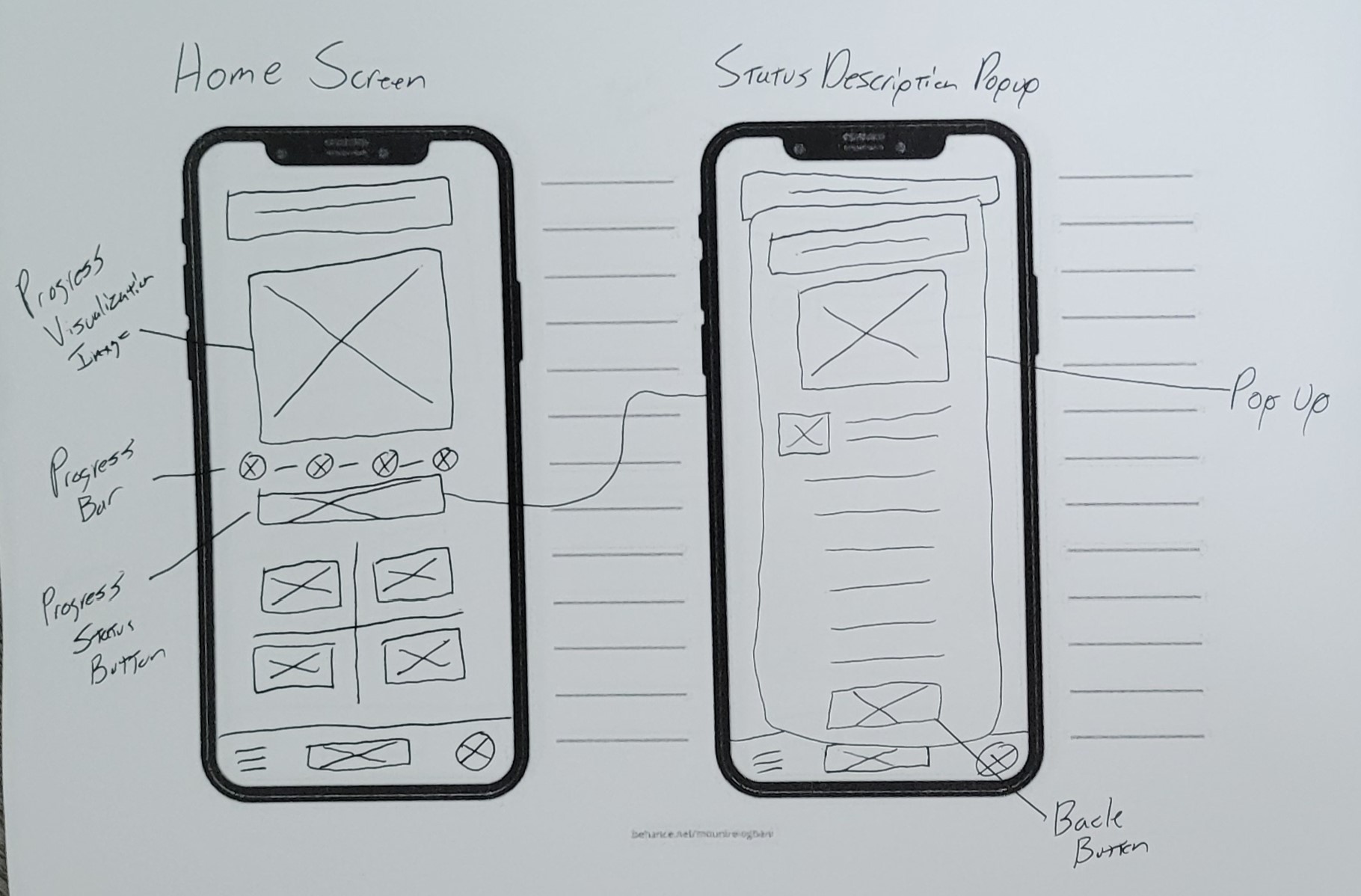
1. Give the users the ability to see the build process at a glance and get information about what that specific step means.
2. Give users the ability to quickly see if there is a new delay and information about it.
3. Let the users send and receive messages with the build team in a dedicated area.
Storyboards
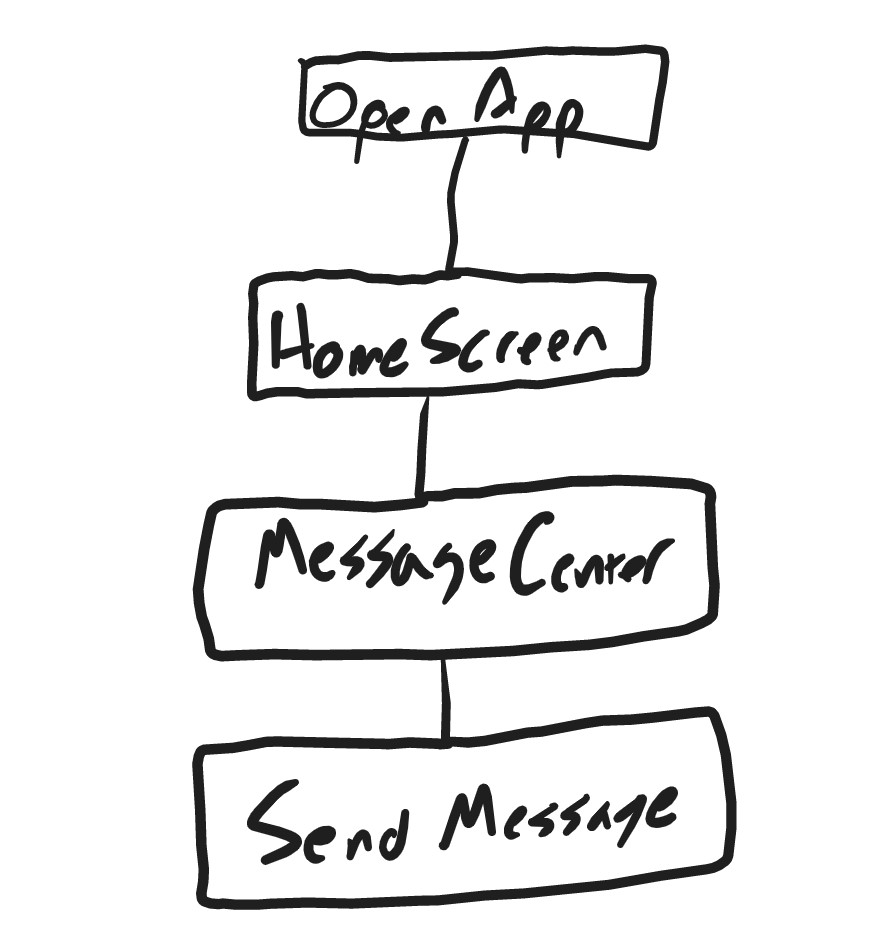
Basic User Flow
I created a user flow with the least amount of steps needed to view build status and send a message.

Putting it together
Low-Fi Paper Wireframe
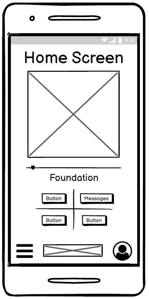
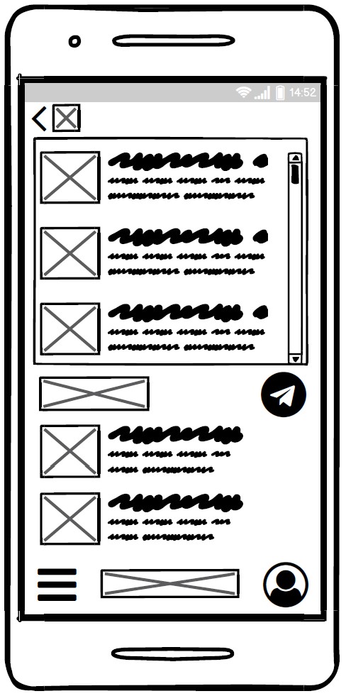
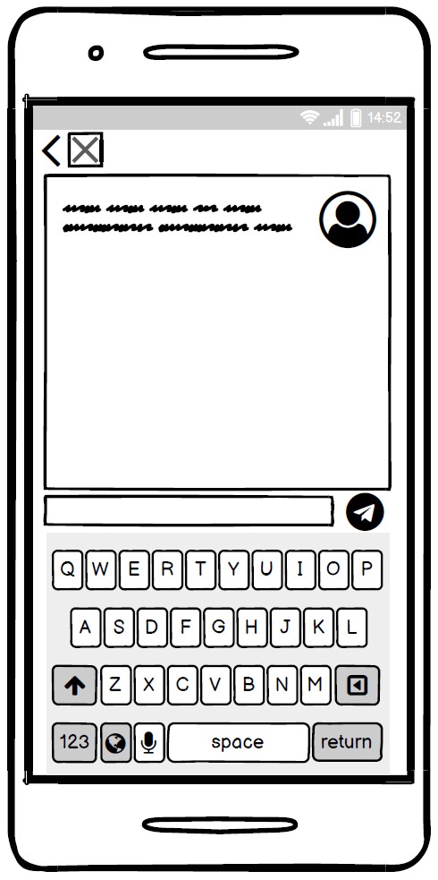
Balsamiq Wireframe
I made a quick mockup in Balsamiq showing the main screen and messaging screen.

User Test Findings
1. Users were unaware that clicking the status description would bring up information about it so they were missing that CTA.
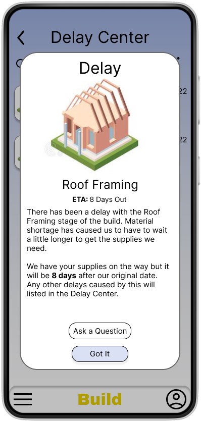
2. Users were able to locate the delays section but were unaware how to find out more information about them.
3. Users had a hard time accurately tapping on specific icons when performing tasks on a touch based input device.
4. Users wanted a way to ask questions about each delay easily.
User Solutions:
1. Add a CTA button at the end of the status description.
2. Add a brief description under the delay that acts as a CTA for the user.
3. Added notification icon to new Delays to entice user to click on.
4. Resize icons and make sure they meet industry standards.
5. Add a link on each delay that opens a new message window specific to that delay.
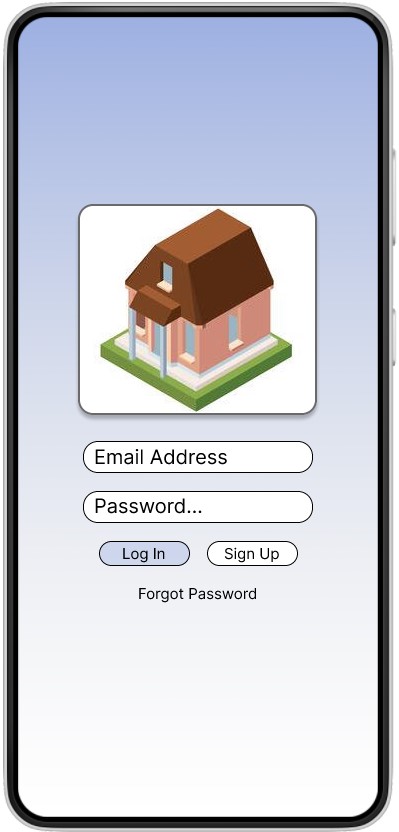
Visual Design
What I Learned
Research is for listening! This was a very popular topic to speak on. I had no problems getting feedback from people regarding their experiences with having a house built. Everyone interviewed had no shortage of examples where they had a pain point. I had an easy time just sitting back and listening. I bring this up because I received a lot more information from the interviews than I did the online survey even with the ability to free type. This makes sense but the difference was a lot bigger than I expected. I think surveys are super valuable but in person interviews are invaluable.
